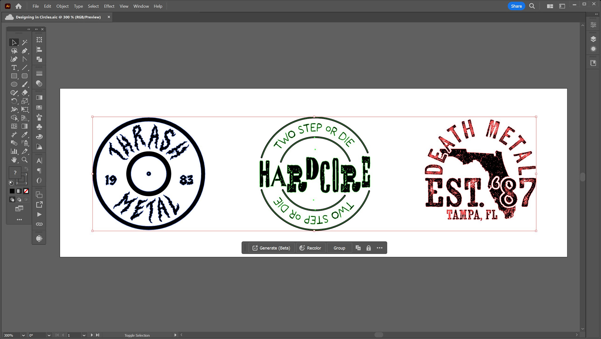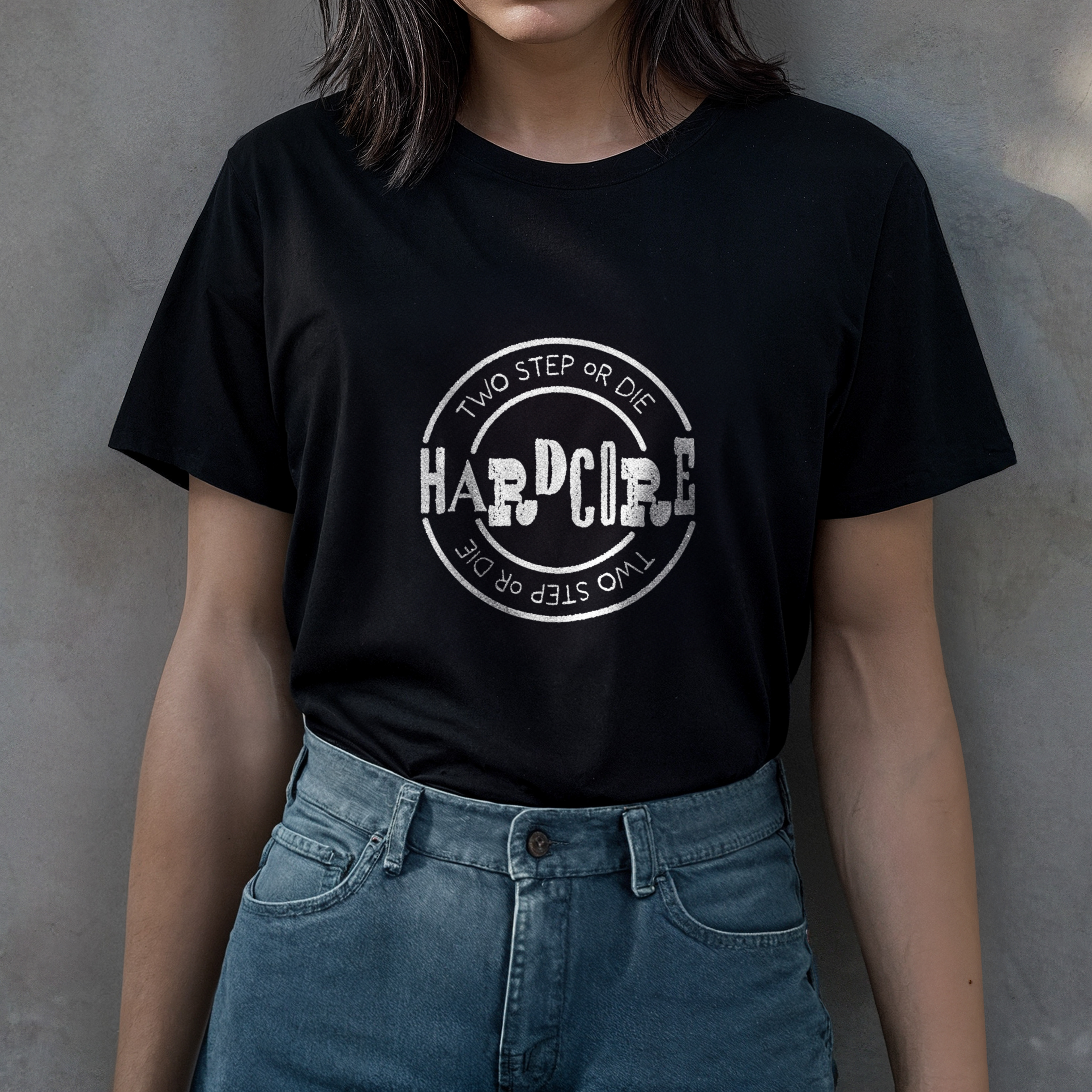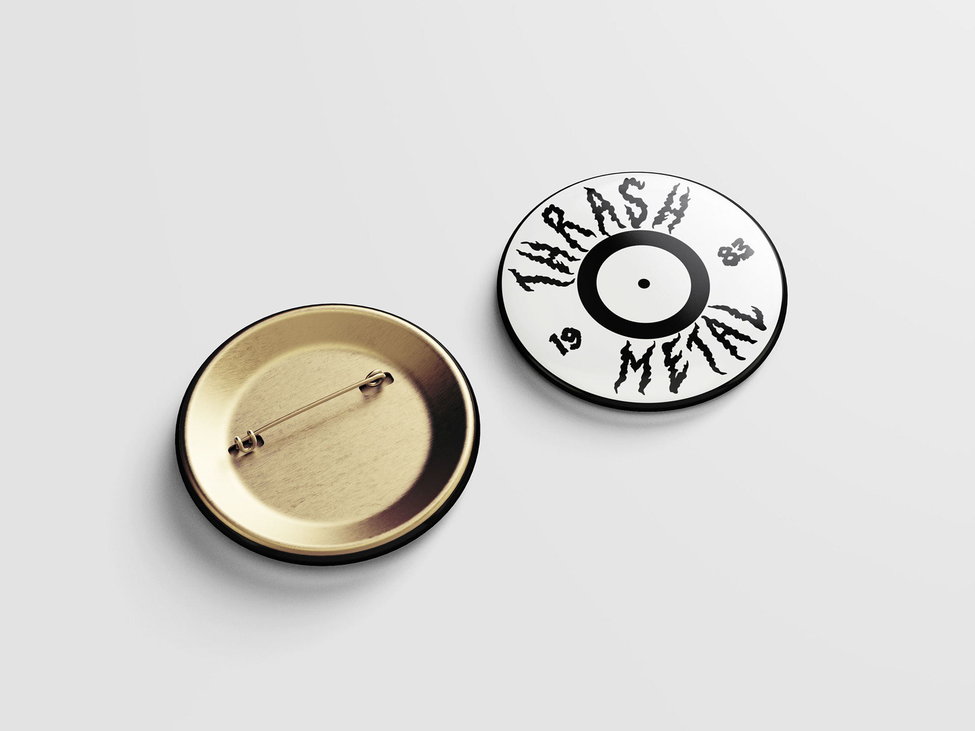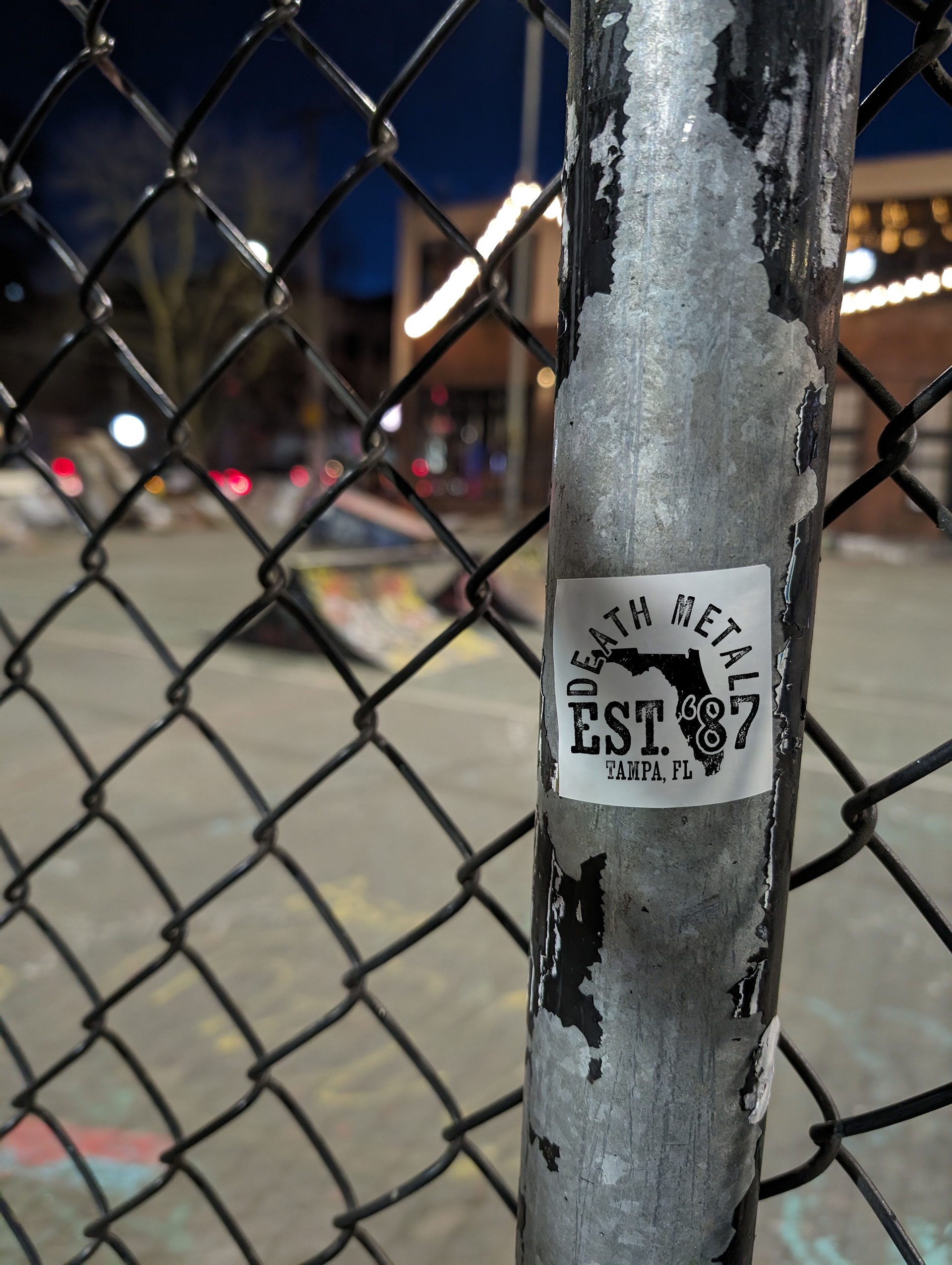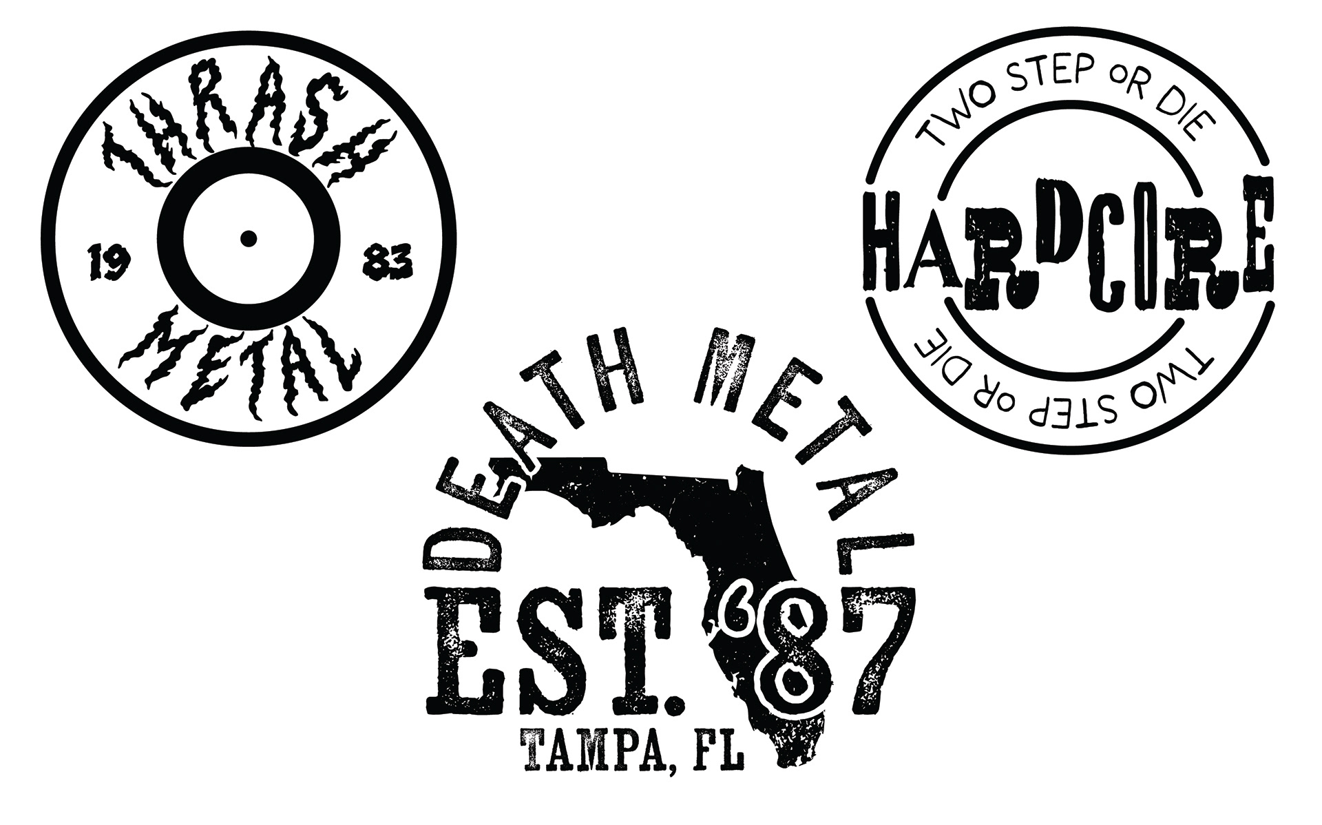
These three metal genre logos were made with circles as the base of the shape. One major challenge was appropriately fitting the type in the shapes. This challenge was overcome through unit measuring and type distortion.
Each typeface used for their respective logo is representative of the sound of the genre, such as the concrete heaviness of death metal. After the type was chosen, choosing the right border/illustration style was crucial to get the aesthetics right.