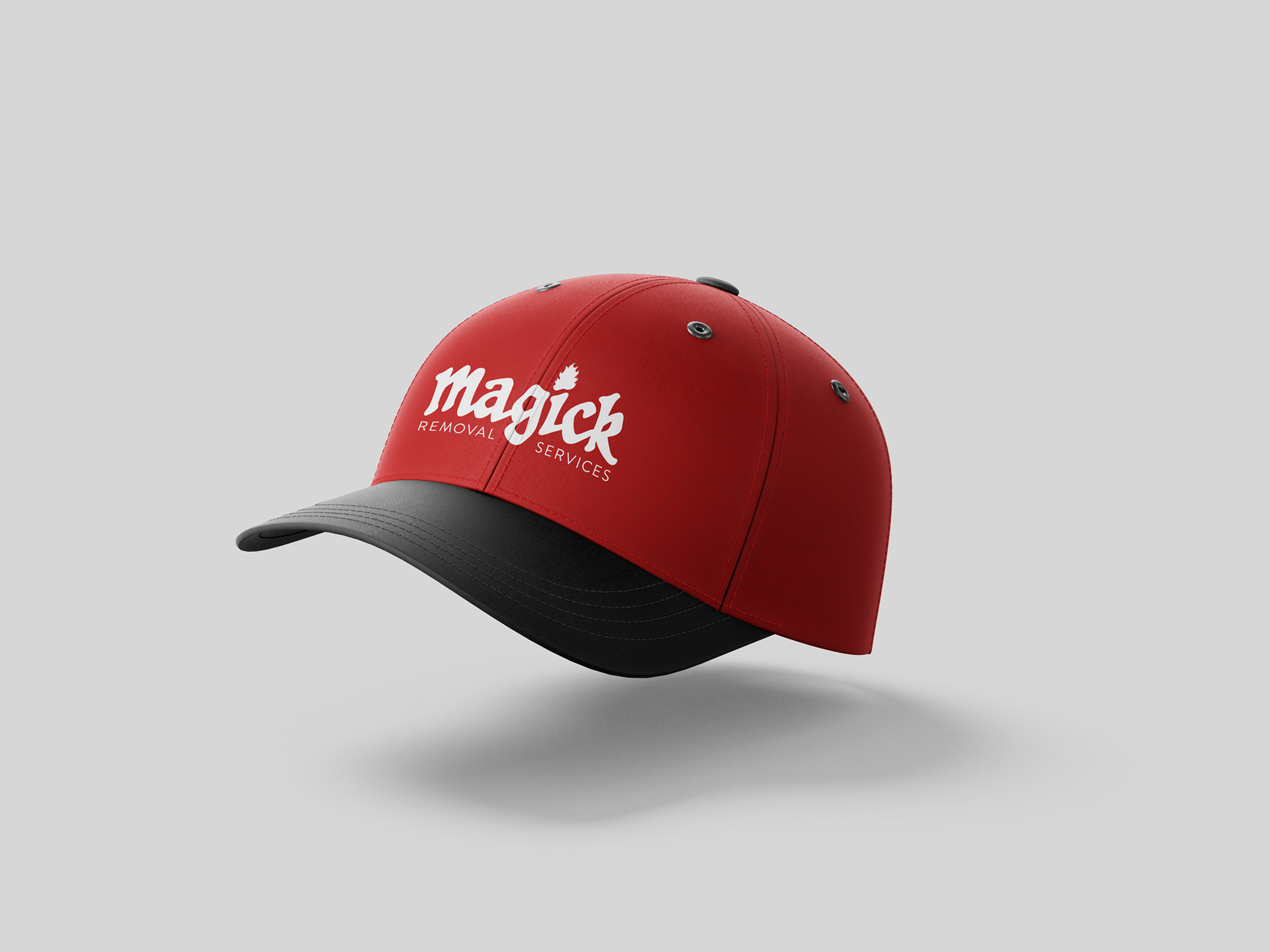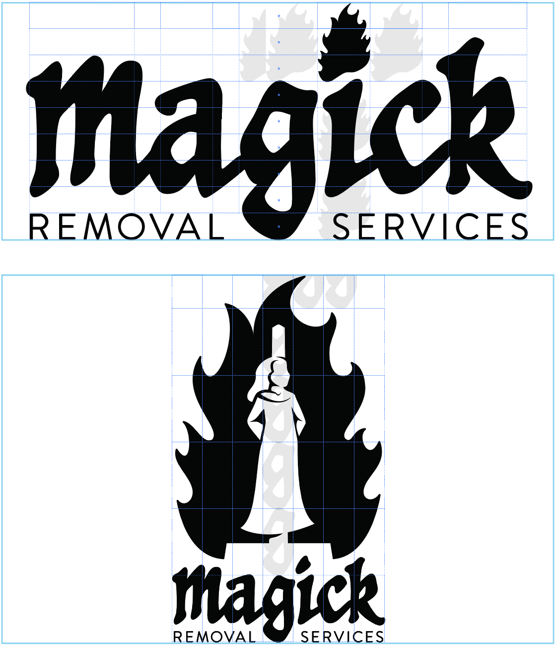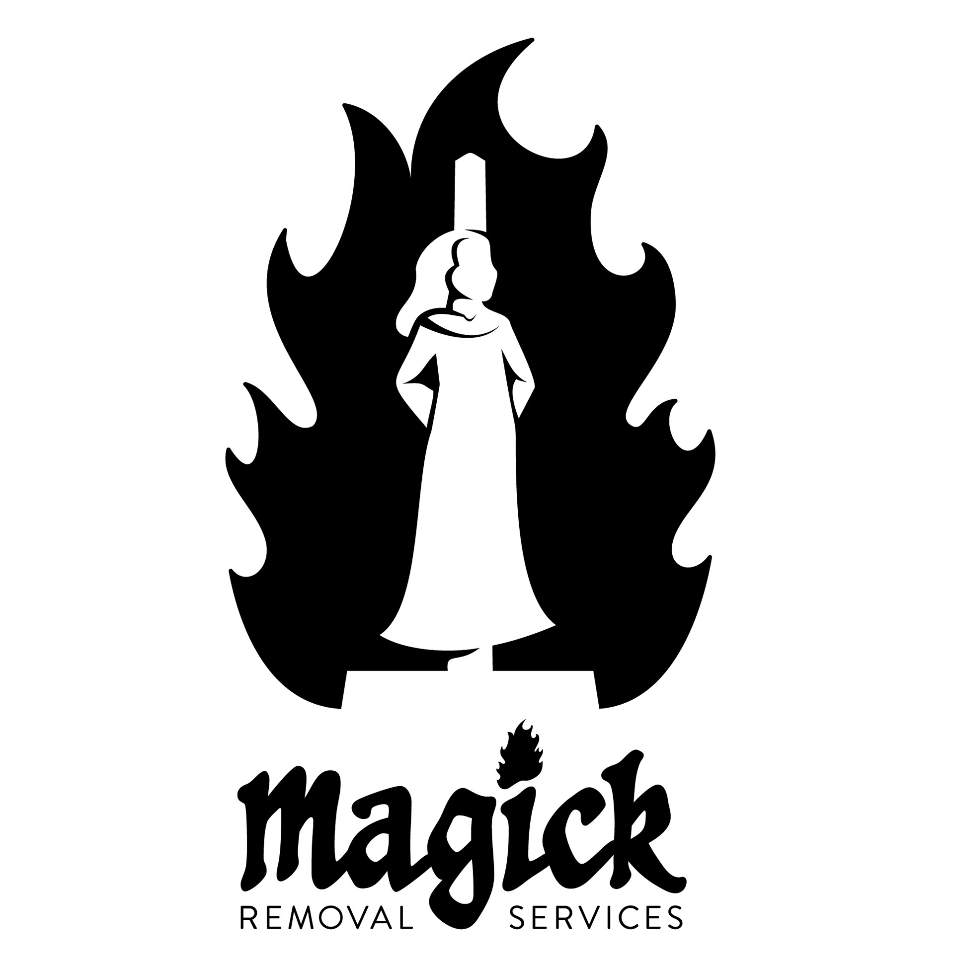
While searching for a fiery design challenge, a fictional brand identity called Magick Removal Services was created.
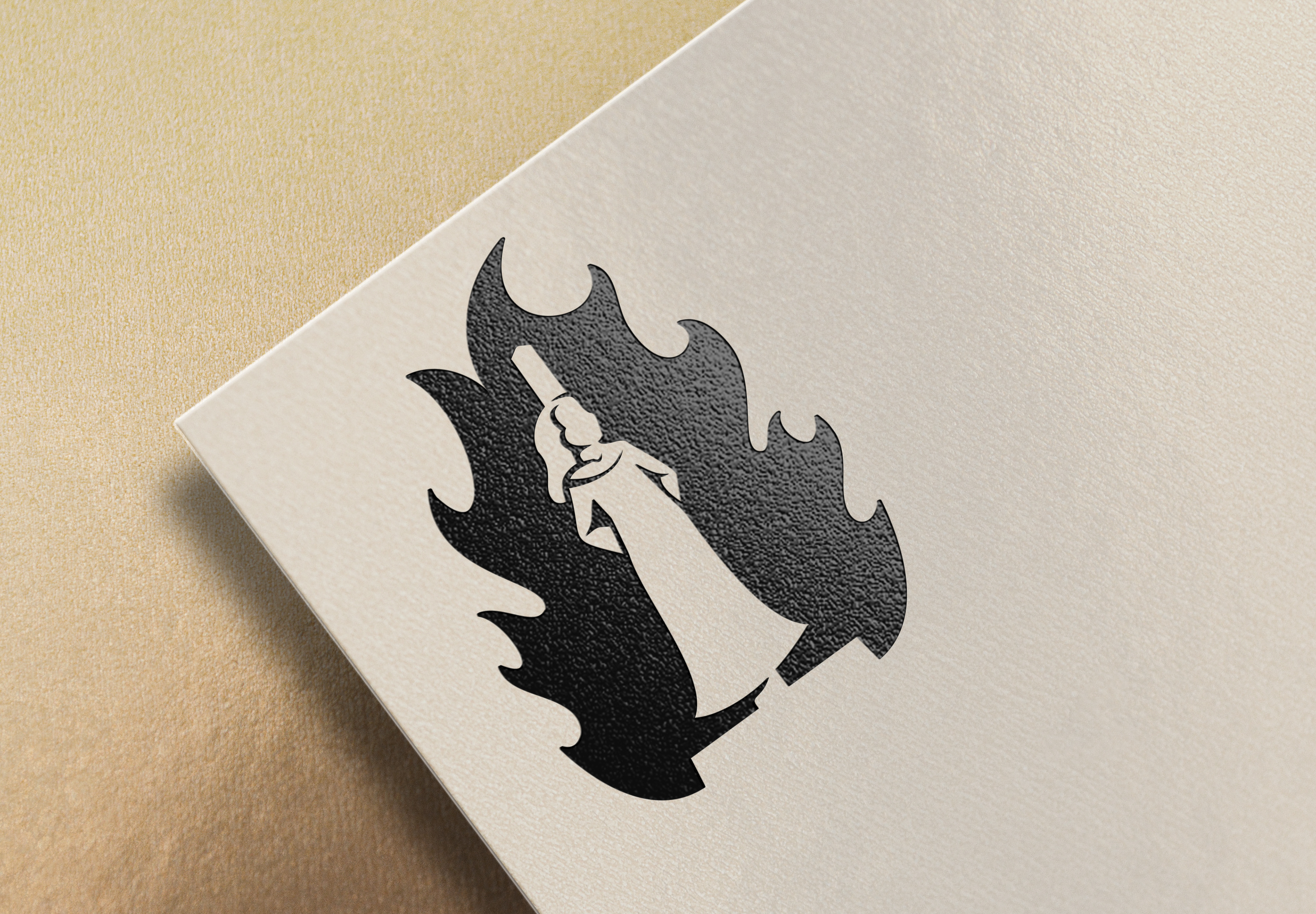
The icon of a burning witch was created using only one shape. The word mark cycled through about 30 different typefaces until the current typeface was chosen. From there, modifying them to fit the aesthetic was a bit of a challenge. After designing the main elements, a stationery set was then developed. The possibilities for future merchandise/products are almost endless.